
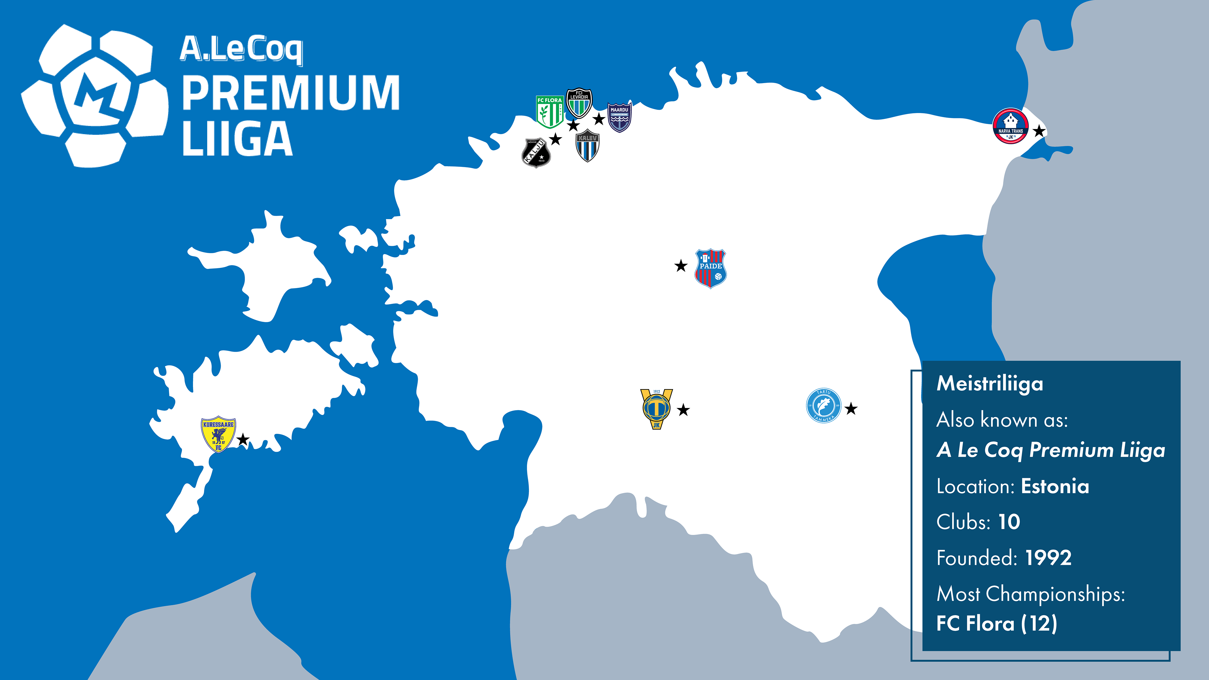
The Project
The Meistriliiga, also known as the A. Le Coq Premium Liiga, is the highest level football league in Estonia. This personal project was an exploration into modernizing a sports league whose designs largely feel outdated.
Goals
Bring some attention to a mostly unheard-of league
Make team identities more modern and more memorable
Find inspiration in each team's heritage and city to enhance their brand
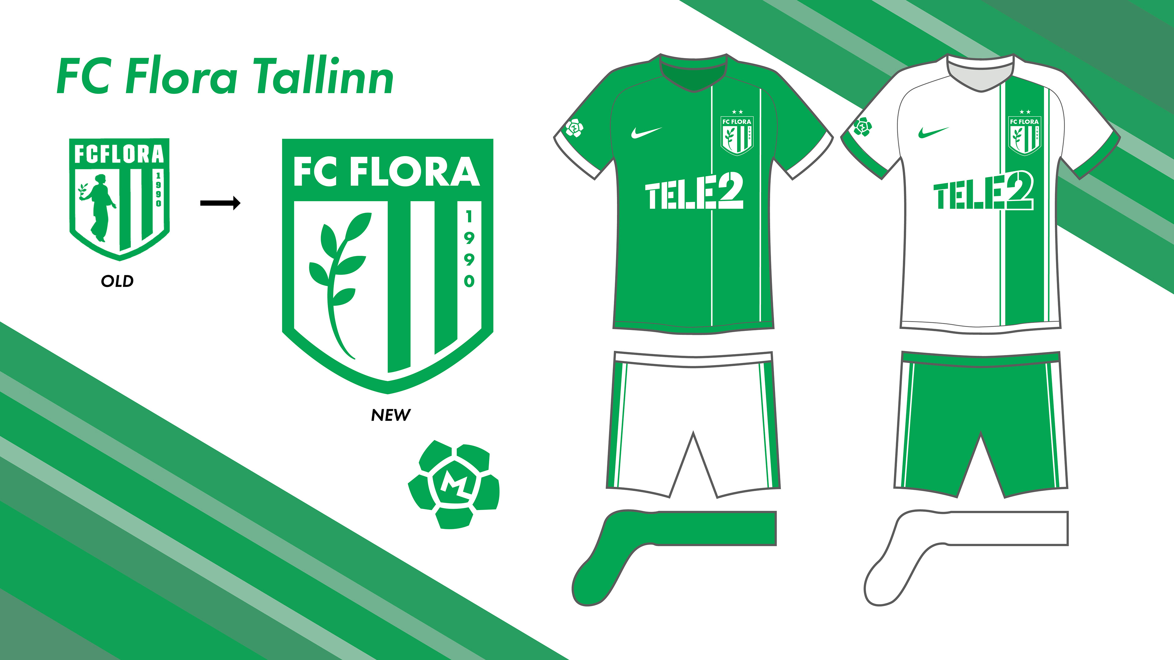
We begin with FC Flora, the winningest club in league history, with 12 championship titles. Main changes were to the crest, simplifying the silhouette to make it more identifiable at a distance.
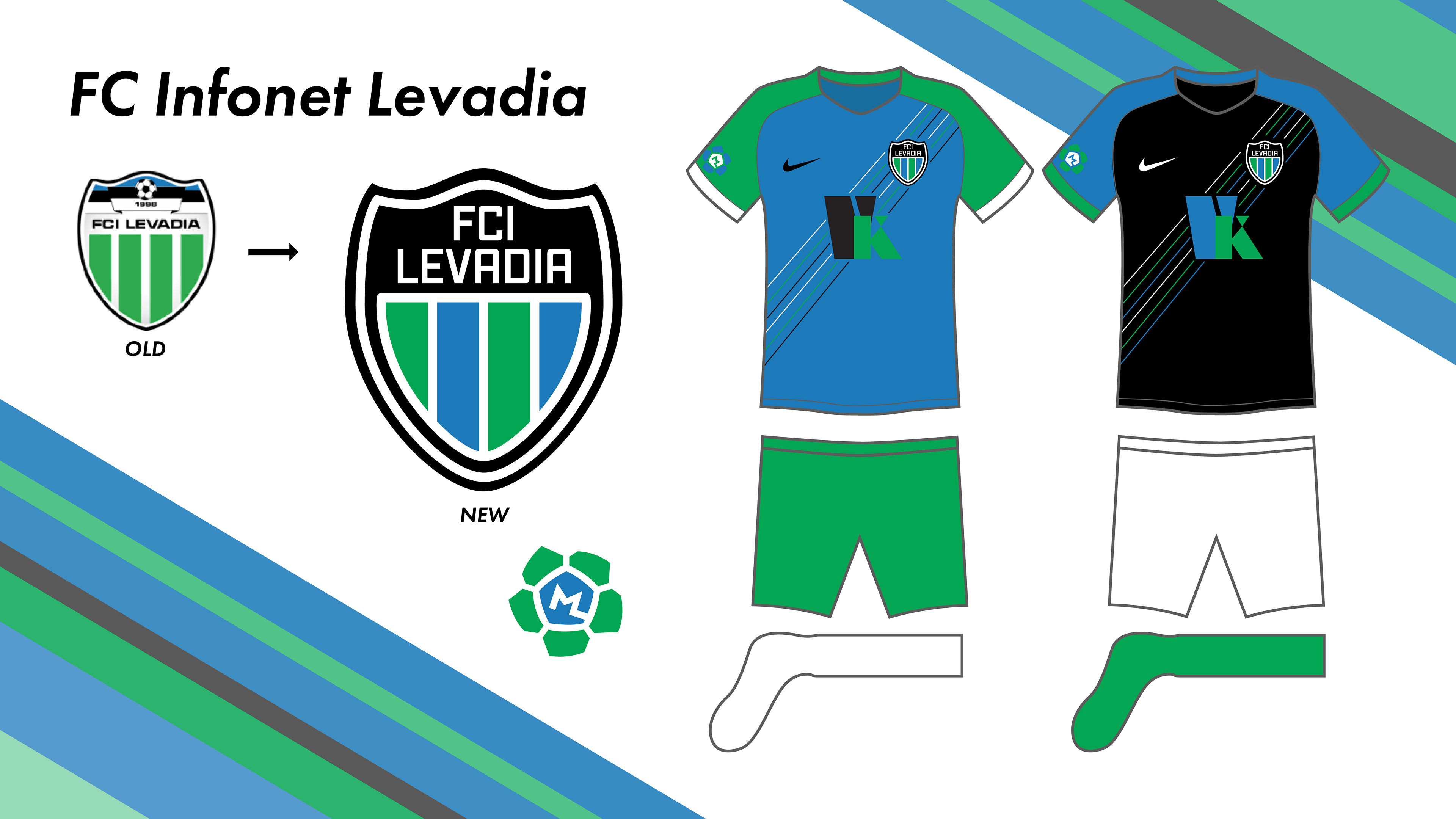
FC Levadia is Flora's main rival, and the two clubs share a stadium. As it currently stands, Levadia shares the same green and white color scheme as Flora, so in this rebrand, I adjusted their colors to make them more distinctive.
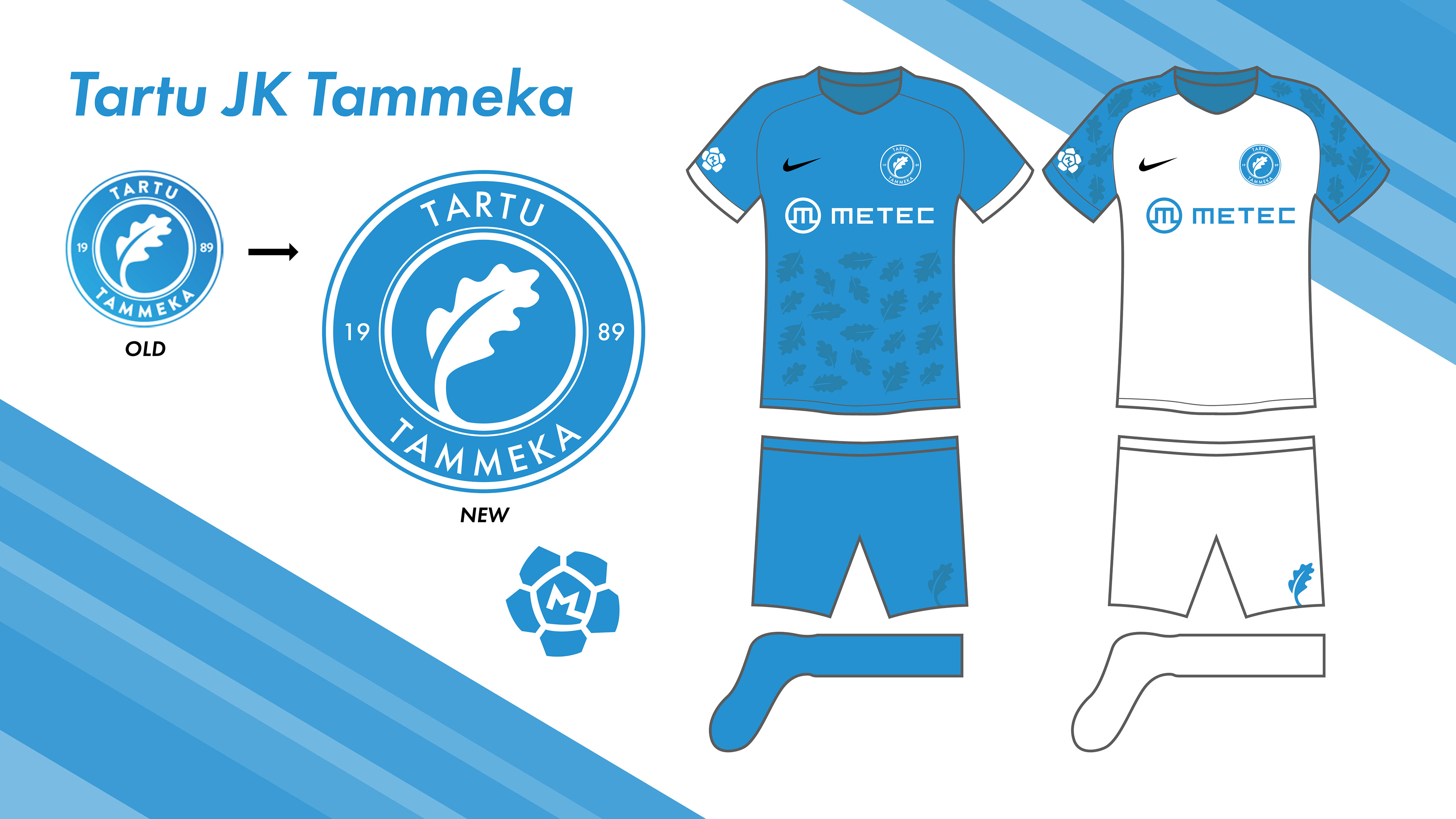
Tammeka roughly translates to "Oaks", so for Tartu's kits I attempted to use oak leaves as a subtle pattern. Only slight adjustments were made for the crest, mainly removing the gradient.
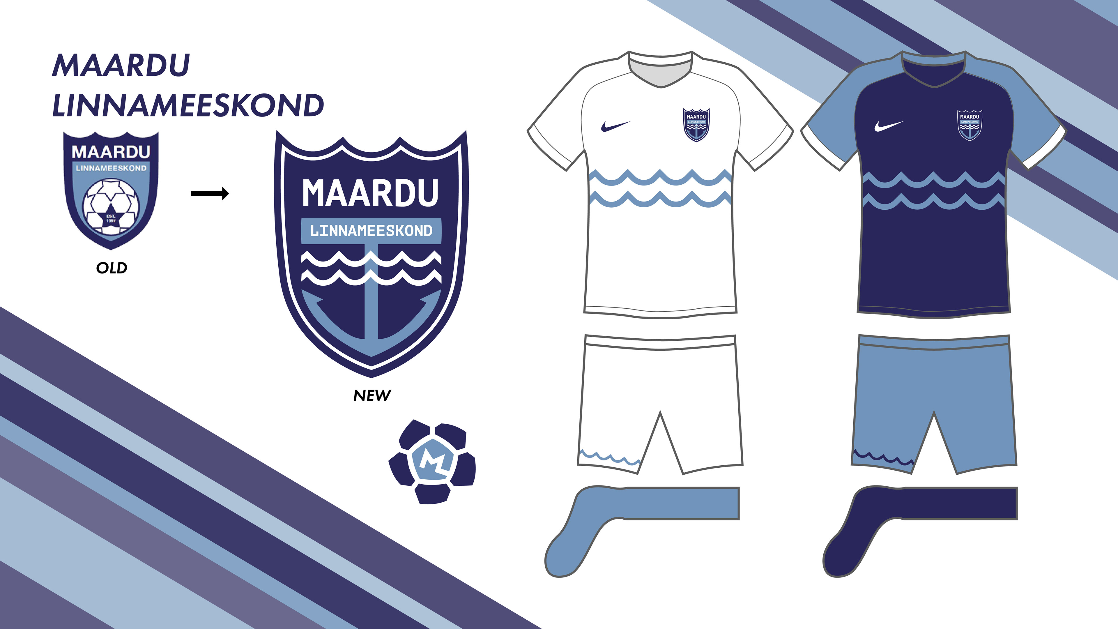
Maardu is best known as a port town in Estonia, so their new identity embraced a maritime theme. Note: Since the completion of this project, Maardu has been relegated to Estonia's First Division.
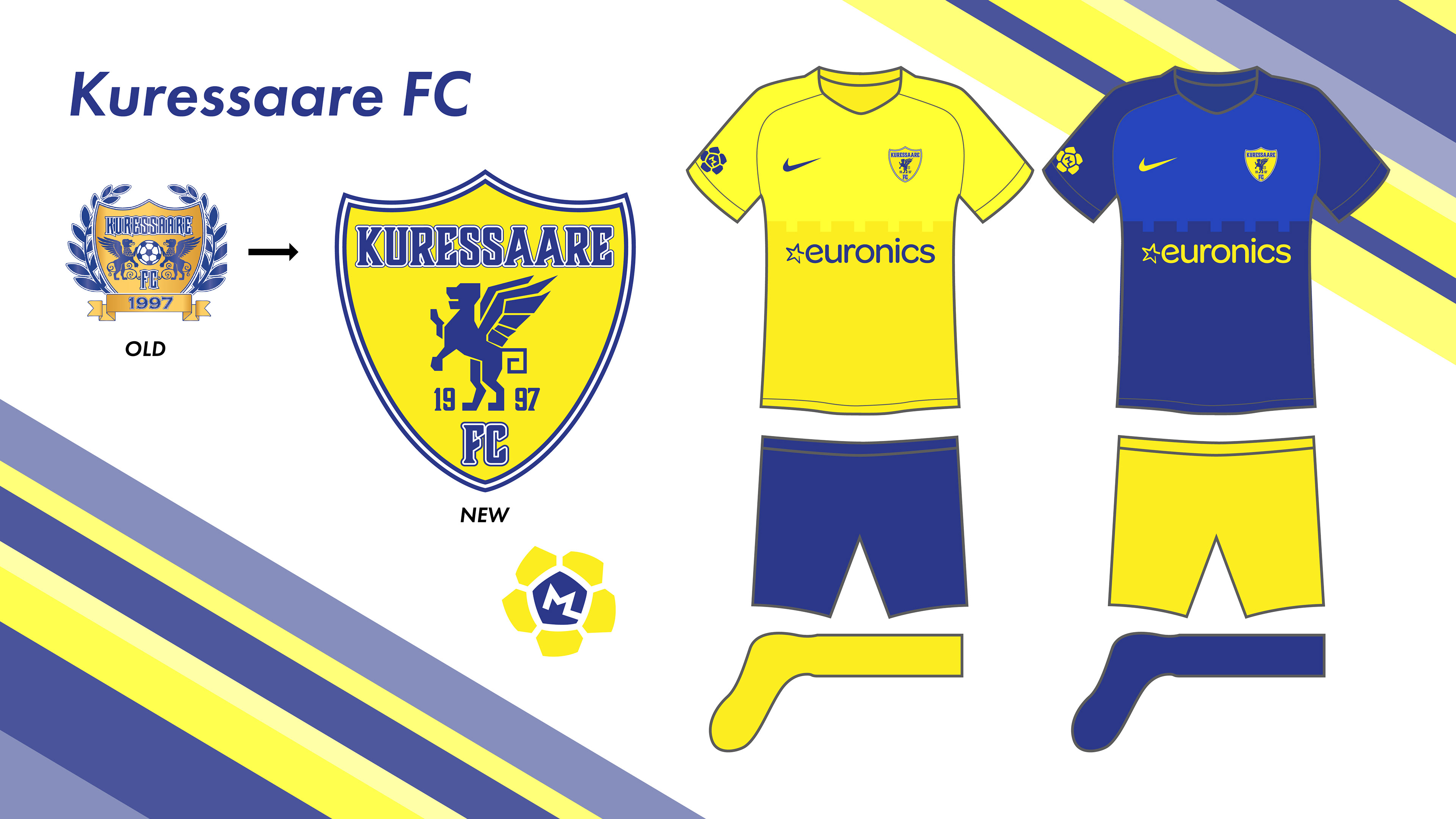
Kuressaare is the only club in the league to play outside of the mainland, on the island of Saaremaa. The city is best known for the Kuressaare castle, hence the castle wall pattern on the jerseys.
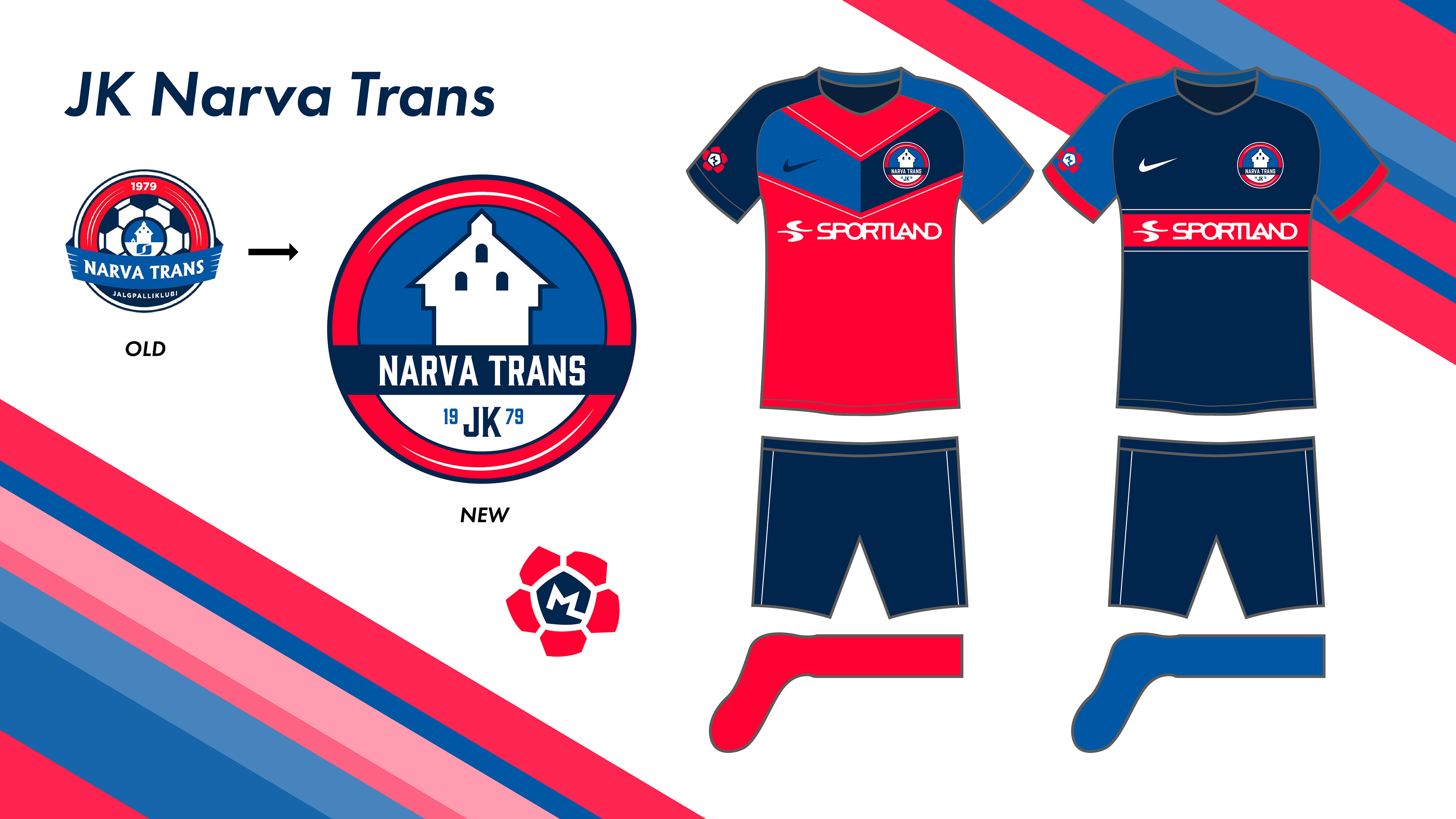
The focus for Norva Football Club's rebrand was simplifying the crest, which depicts the Narva castle's main tower.
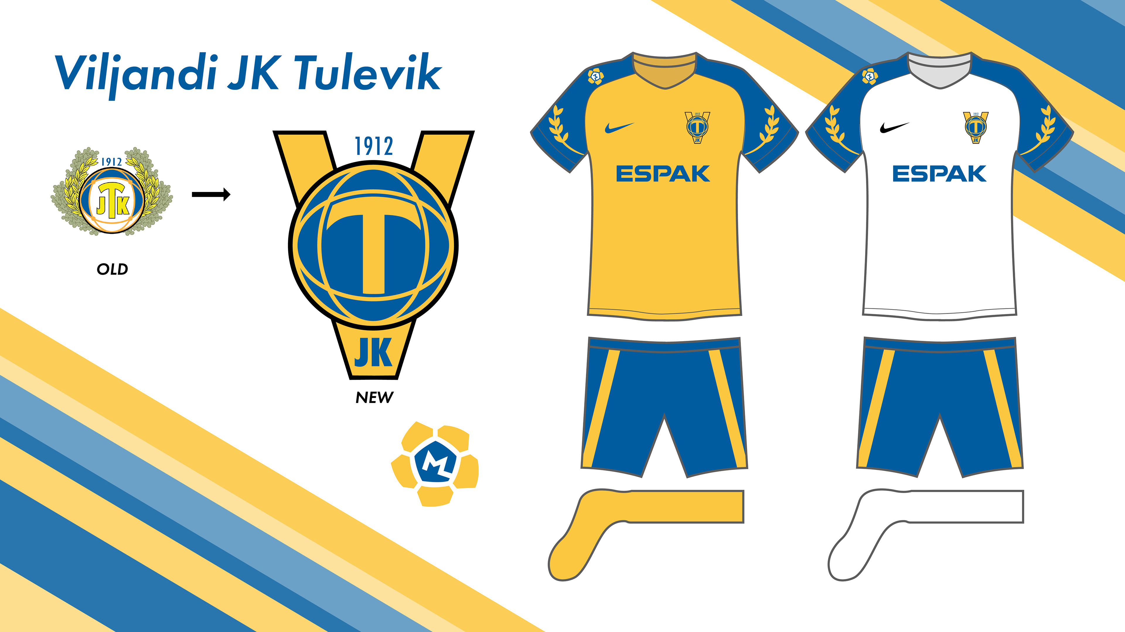
Viljandi Tulevik (Translation: Viljandi "Future") had one of the more puzzling crests. It did not read well, and had far too much detail due to the leaves. The new look slims down their color scheme, makes the logo more readable, separating the V, T and JK into separate elements, and implemented the leaf imagery on the sleeves of the jerseys. The striping on the sides of the shorts are meant to resemble V's.
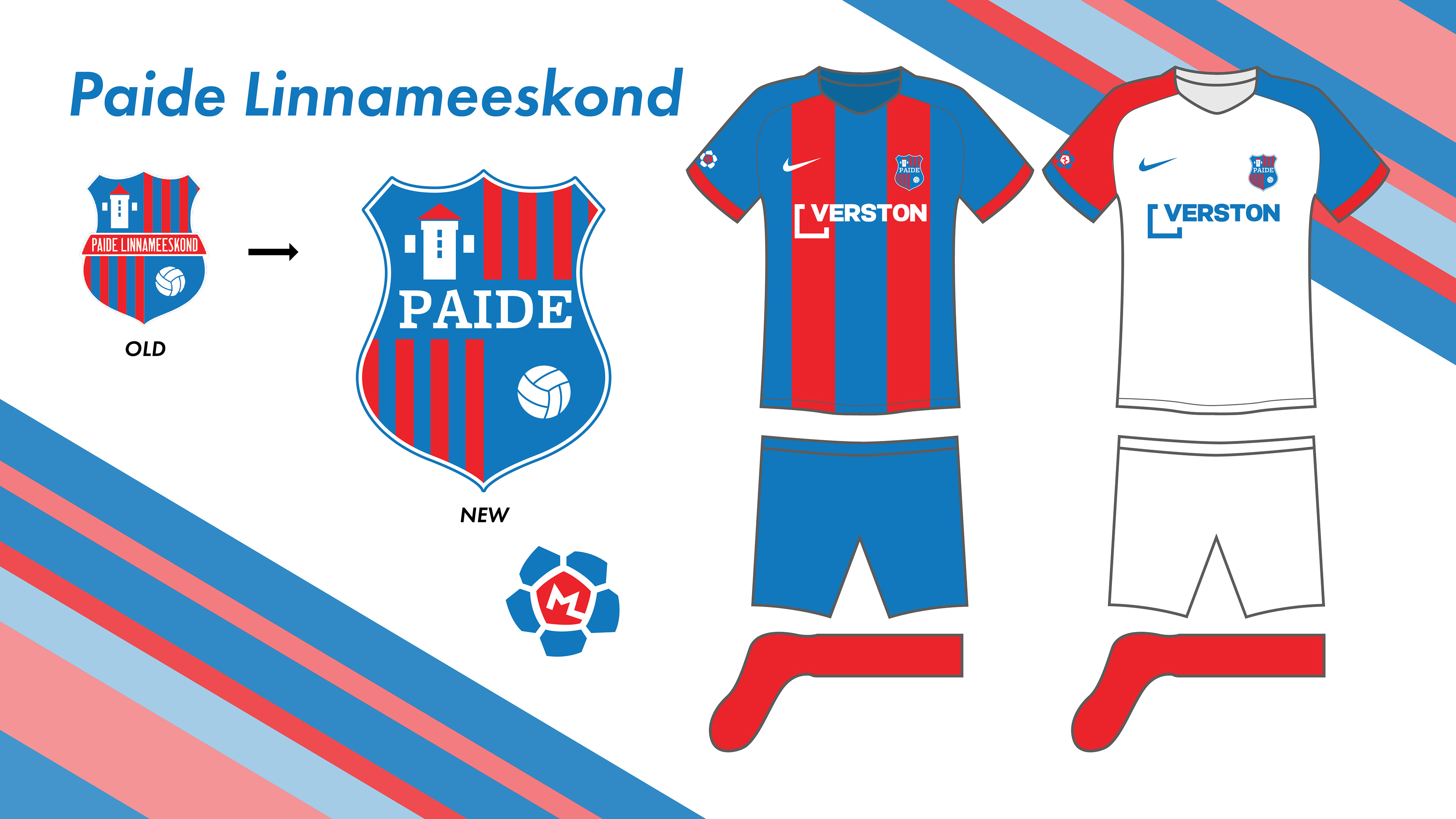
Paide already had a fairly strong brand to begin with. The main revision was done to the typography on the crest in order to improve legibility, especially at a distance. The kits now incorporate the stripes from the crest into their design.
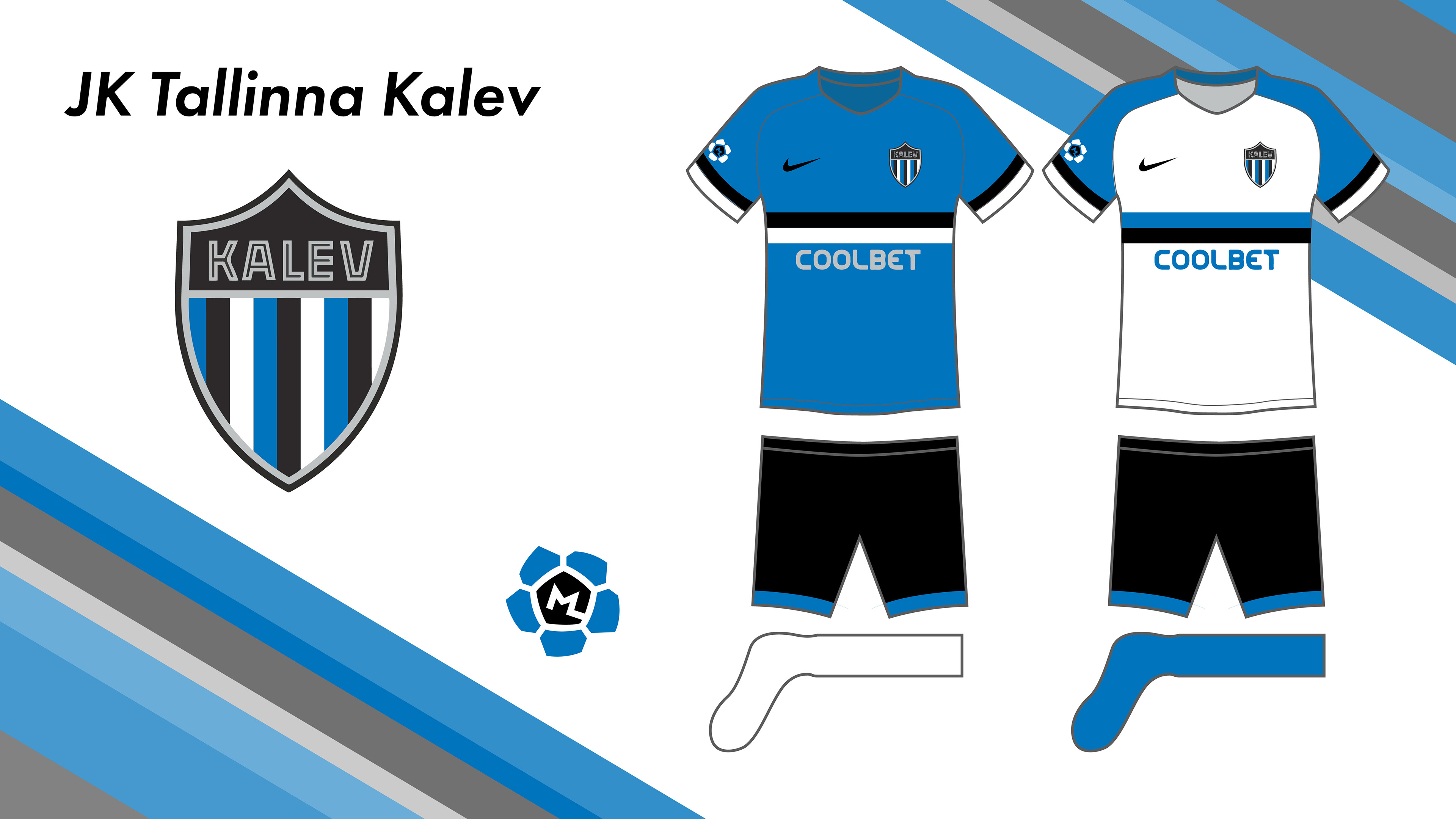
Tallinn's third team, Kalev, was the only one to not have any changes made to the crest. I found it to be practically perfect the way it is. The main focus was on the kits, as currently Kalev wears plain blue jerseys with white stripes on the sleeves. These ones seamlessly implement the Estonian flag into the design.
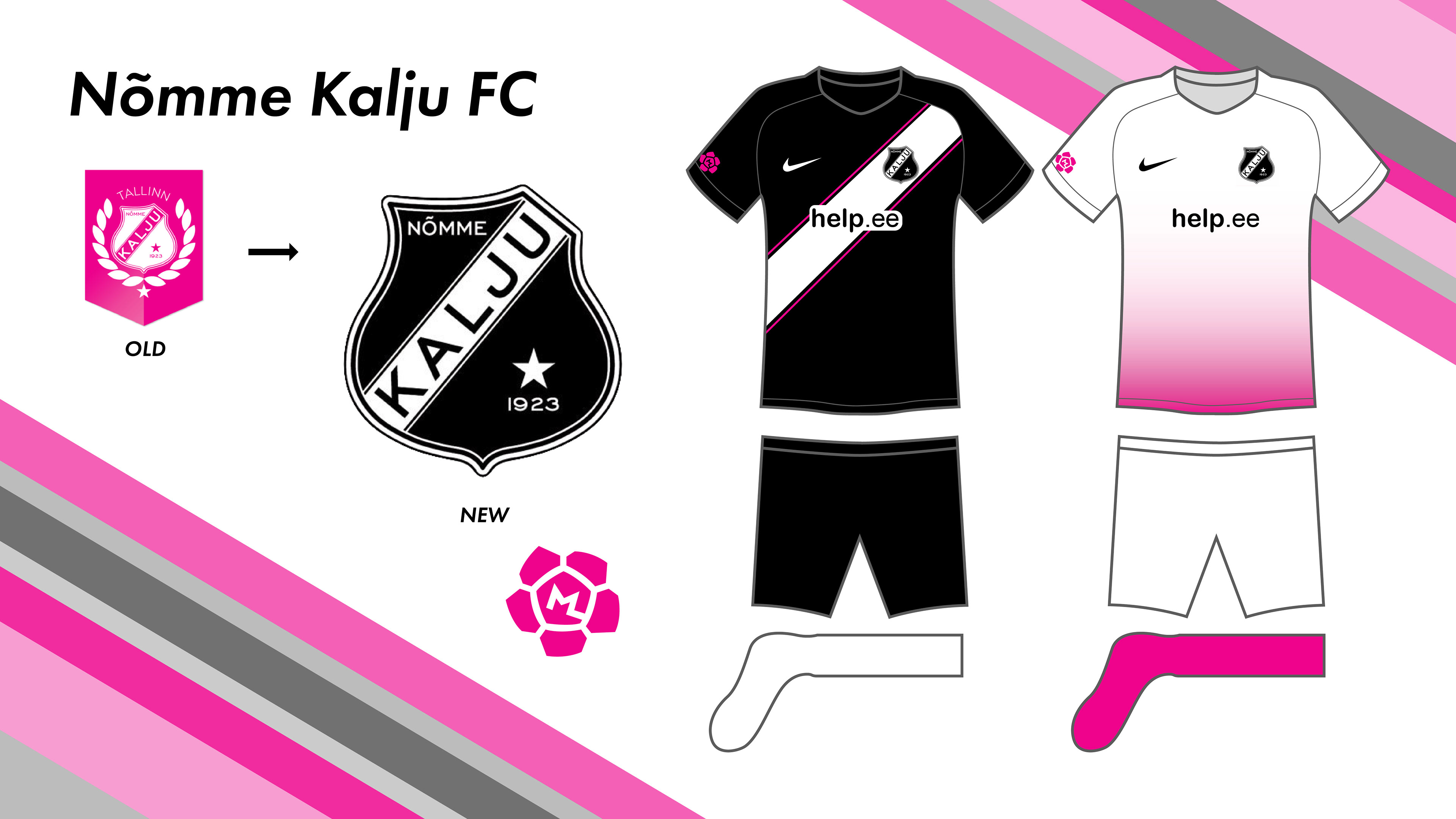
Nõmme Kalju was the only team where I decided to revert to a former crest. They recently began to use the pink version that has unnecessary details such as the gradient and the leaf pattern. Their previous crest, the black and white one, was much superior and a fan favorite.